Summary by James R. Martin, Ph.D., CMA
Professor Emeritus, University of South Florida
Economics Main Page | History
and Development Main Page
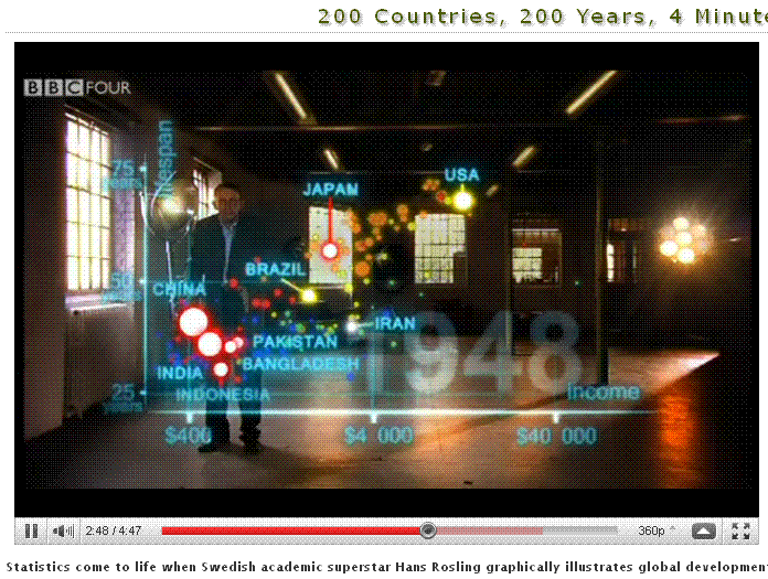
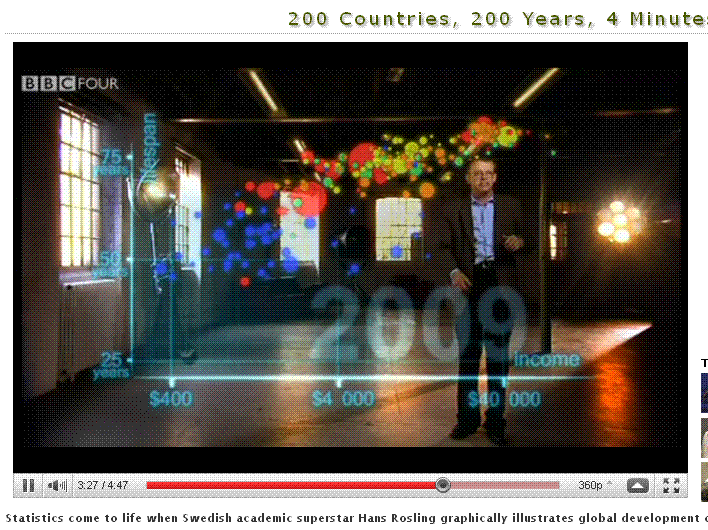
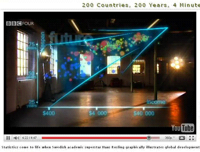
This is an interesting video by Hans Rosling who illustrates the economic development of 200 countries over the last 200 years. Life expectancy is placed on the vertical axis and income per person is represented on the horizontal axis. Life expectancy ranges from 25 years to 75 years while income per person ranges from $400 to $40,000. According to Rosling, the series of graphics illustrated represents 120,000 numbers plotted to show the changes in life expectancy and income per person from 1810 to 2010.
Each country is presented as a circle or bubble, and the size indicates the relative size of the country's population. The colors of the bubbles indicate the country's location. Blue is Africa, Red is Asia, Orange (he calls it brown) is Europe, Yellow is the Americas, and Green is the Mid-east. The 2010 graphic (see above) shows what Rosling refers to as a converging world where all countries are moving up from the condition of poor and sick toward a condition of rich and healthy. A couple of other screen captures show the changes since 1948.
See the video at Youtube
________________________________________________
Related summaries:
Buchanan, M. 2002. Wealth happens. Harvard Business Review (April): 49-54. (Buchanan describes a universal law of wealth based on a network effect that appears to have some important implications for economic policy). (Note).
Martin, J. R. Not dated. 200 years of accounting history dates and events. Management And Accounting Web. AccountingHistory
Some other useful links:
For an explanation of the software used in the video see Trendalyzer
For more on this software and Rosling's work see Gapminder
For more Rosling Gapminder videos see Gapminder
To see the entire 200 years develop see the Gapminder World Tool
To get Gapminder Desktop go to Gapminder