Provided by James R. Martin, Ph.D., CMA
Professor Emeritus, University of South Florida
Learning Maps and Games Main
Page | Education Issues Main Page
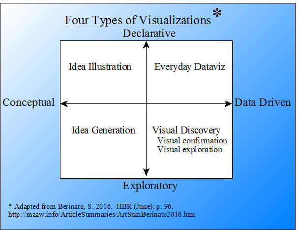
There are perhaps hundreds of different types of graphic illustrations that connect ideas, concepts and data to promote learning and to explore relationships.1 They are all similar in that they help the user visualize and understand the concepts, relationships, or processes illustrated. However, according to a typology developed by Scott Berinato, there are only four main types of visualizations as indicated in the graphic below.
The purpose of this summary is to briefly define and illustrate a variety of graphic techniques that are used on the MAAW web site to convey relationships that promote learning. The following visualizations are categorized using Berinato's typology.2 Brief definitions of the techniques are provided below along with examples, and links to their sources on the MAAW site.
Idea Illustration - Conceptual and Declarative
Idea illustration includes a variety of graphics such as process diagrams, charts, and decision trees. The majority of visualizations found in management and accounting articles fit into this category. Some types of idea illustrations include: Concept maps, strategy maps, strategy canvases and value curves, value stream maps, flow charts, decision trees, organigraphs, and fishbone diagrams.
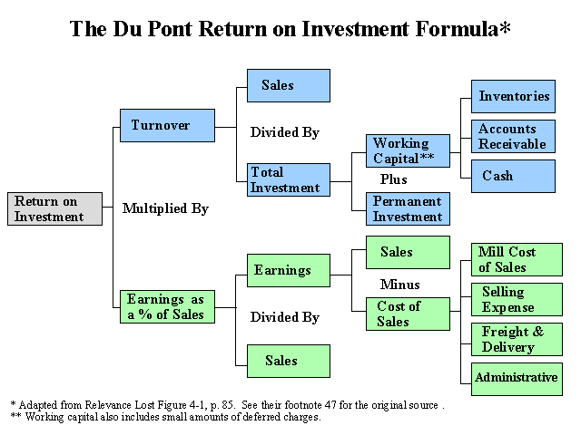
Concept Maps - A concept map is a conceptual diagram that illustrates relationships between concepts. It is a graphical tool used to organize and structure knowledge. The Du Pont ROI graphic is from Martin, J. R. Not dated. Relevance Lost in a question and answer format. Management And Accounting Web. RelevanceLostLongQues
The framework for research methodology graphic below is from Buckley, J. W., M. H. Buckley and H. Chiang. 1976. Research Methodology and Business Decisions. National Association of Accountants. (Summary).

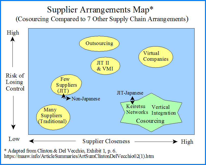
The concept map below shows different supplier arrangements. See Clinton, B. D. and S. C. Del Vecchio. 2002. Cosourcing in manufacturing. Journal of Cost Management (September/October): 5-12. (Summary).
Strategy Maps - A strategy map is a diagram designed to show the strategic goals of an organization frequently associated with the balanced scorecard. The following illustration is from Kaplan, R. S. and D. P. Norton. 2001. The Strategy-Focused Organization: How Balanced Scorecard Companies Thrive in the New Business Environment. Harvard Business School Press. (Summary).

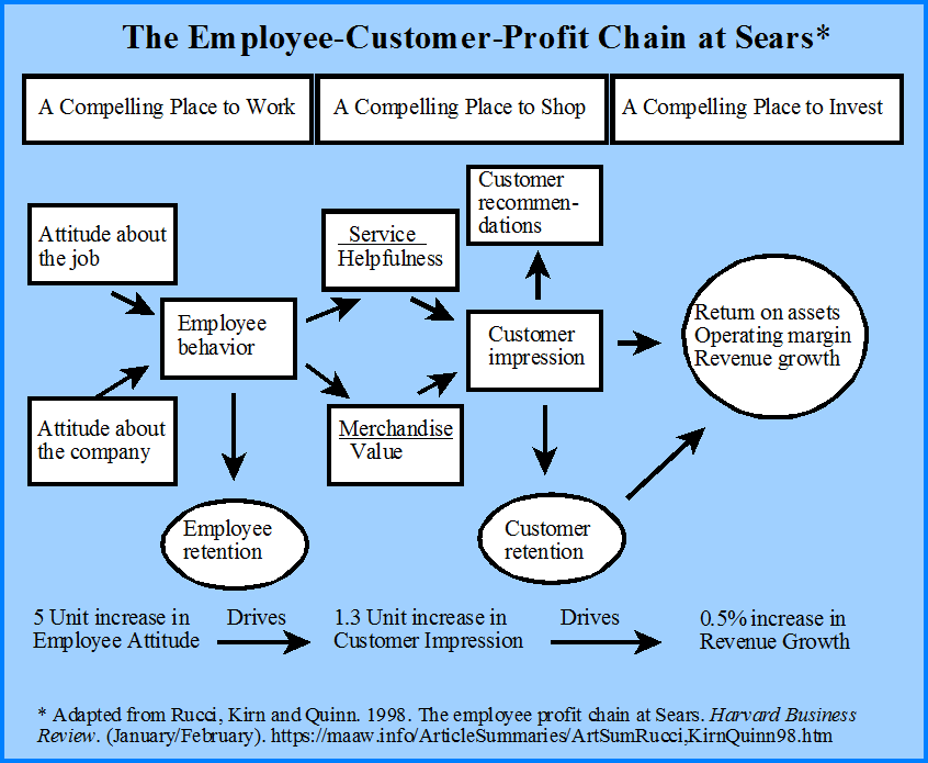
Sears causal model also conveys to same idea as the illustration above and might be referred to as a strategy map. See Rucci, A. J., S. P. Kirn and R. T. Quinn. 1998. The employee-customer-profit chain at Sears. Harvard Business Review (January-February): 82-97. (Summary).
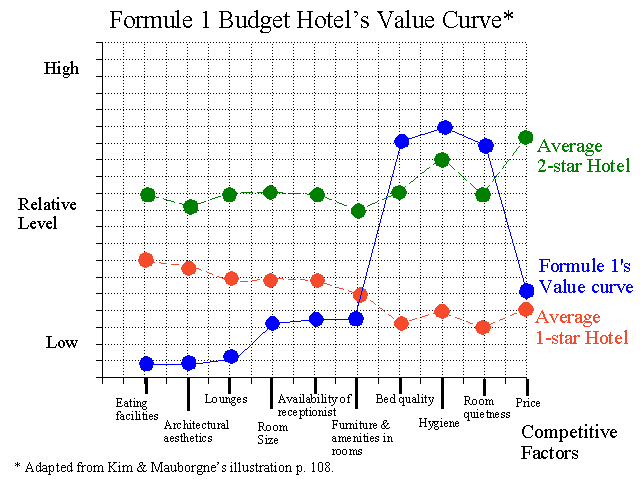
Strategy Canvases and Value Curves - A strategy canvas, or value curve is a visual chart of a company's strategy. It represents a graphic depiction of a company's relative performance across its industry's key success factors. The strategy canvas or value curve for Budget Hotel is from Kim, W. C. and R. Mauborgne. 1997. Value innovation: The strategic logic of high growth. Harvard Business Review (January-February): 103-112. (Summary).
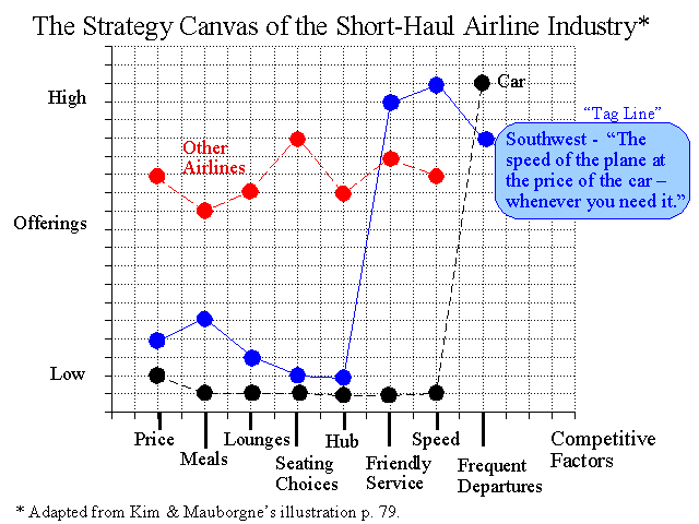
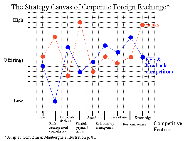
The two strategy canvases below are from Kim, W. C. and R. Mauborgne. 2002. Charting your company's future. Harvard Business Review (June): 77-83. (Summary).
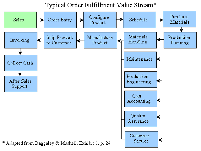
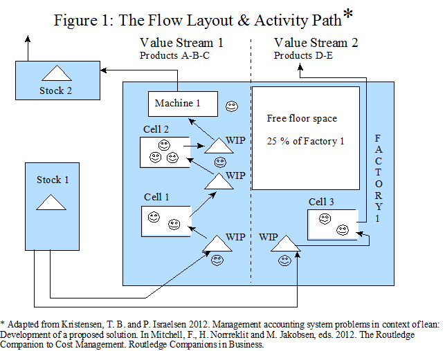
Value Stream Maps - A value stream map shows the flow layout and activity path of a product or service from beginning to end. The order fulfillment value stream below is from Baggaley, B. and B. Maskell. 2003. Value stream management for lean companies, Part I. Journal of Cost Management (March/April): 23-27. (Summary).
The following value stream map for two groups of products is from Kristensen, T. B. and P. Israelsen 2012. Management accounting system problems in context of lean: Development of a proposed solution. In Mitchell, F., H. Norrreklit and M. Jakobsen, eds. 2012. The Routledge Companion to Cost Management. Routledge Companions in Business. (Summary).
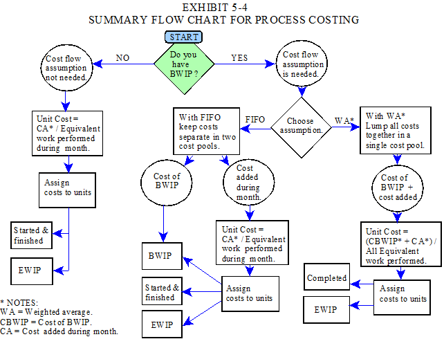
Flowcharts - A flowchart is a diagram that illustrates the steps in a process or workflow. Activities, or process steps are usually represented by a rectangular box, while decisions are denoted by diamonds. The following chart for solving a process costing problem is from Martin, J. R. Not dated. Chapter 5: Normal Historical Full Absorption Process Costing. Management Accounting: Concepts, Techniques & Controversial Issues. Management And Accounting Web. Chapter5
The flowchart for classifying research methodology is from Buckley, J. W., M. H. Buckley and H. Chiang. 1976. Research Methodology and Business Decisions. National Association of Accountants. (Summary).

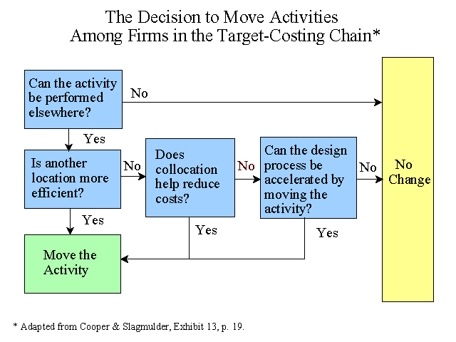
The flowchart showing the decision to move activities among firms in a target-costing chain is from Cooper, R. and R. Slagmulder. 2003. Interorganizational costing, Part 2. Cost Management (November/December): 12-24. (Summary).
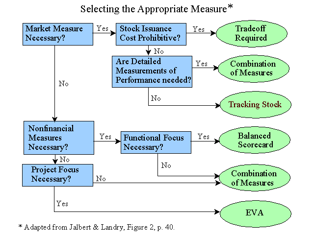
The flowchart below showing how to select an appropriate performance measure for firm is from Jalbert, T. and S. P. Landry. 2003. Which performance measurement is best for your company? Management Accounting Quarterly (Spring): 32-41.(Discussion of EVA, tracking stock and balanced scorecard). (Summary).
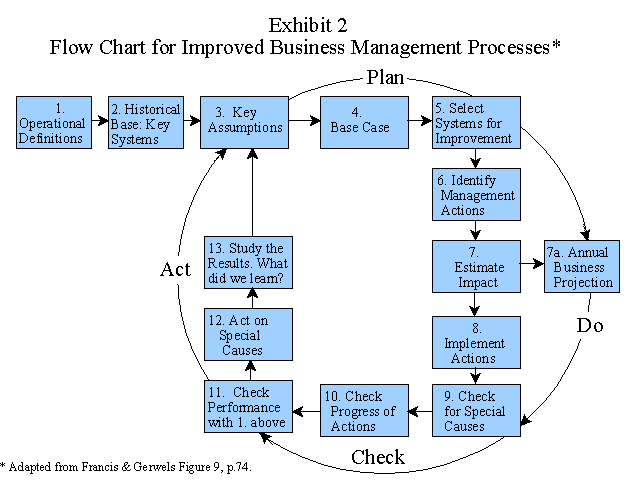
The following flowchart is an expanded version of the Deming-Shewhart continuous improvement graphic. See Francis, A. E. and J. M. Gerwels. 1989. Building a better budget. Quality Progress (October): 70-75. (Summary).
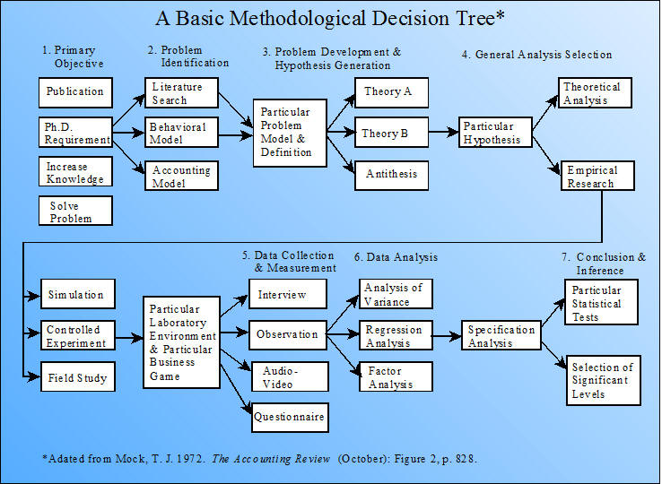
Decision Trees - A decision tree is a type of flowchart. The following illustration related to choosing a research methodology is from Mock, T. J. 1972. A decision tree approach to the methodological decision process. The Accounting Review (October): 826-829. (Note).
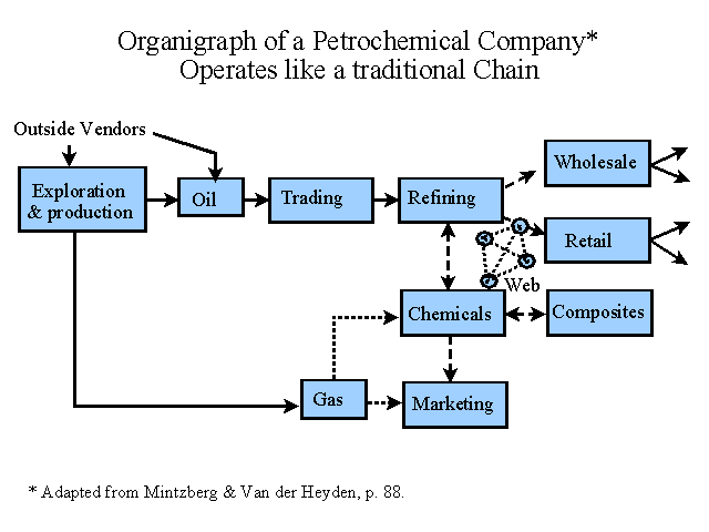
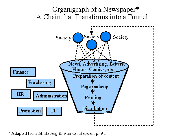
Organigraphs - An organigraph is a drawing, picture, or map of the way people and work are organized within an organization. It shows the connections and the interdependences to help managers see critical relationships and competitive opportunities. An organization chart, on the other hand, puts management at the top and treats everything and everyone as an independent box. The two organigraphs below are from Mintzberg, H. and L. Van der Heyden. 1999. Organigraphs: Drawing how companies really work. Harvard Business Review (September-October): 87-94. (Summary).
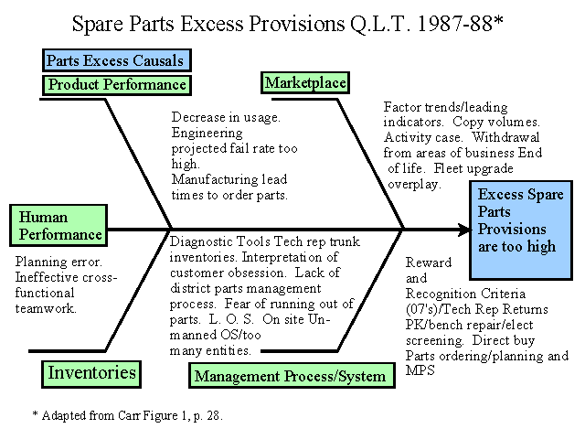
Fishbone Diagrams - A fishbone diagram shows the relationships that may contribute to a particular problem. The fishbone diagram for spare parts excess at Xerox is from Carr, L. P. 1995. How Xerox sustains the cost of quality. Management Accounting (August): 26-32. (Summary).
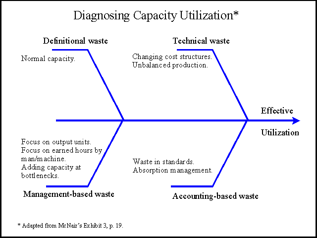
The following fishbone diagram is from McNair, C. J. 1994. The hidden costs of capacity. Journal of Cost Management (Spring): 12-24. (Summary).
Everyday Data Visualizations - Data Driven and Declarative
Everyday dataviz or data-based visualizations are typically simple illustrations such as bar charts, line charts, pie charts, and scatter plots.
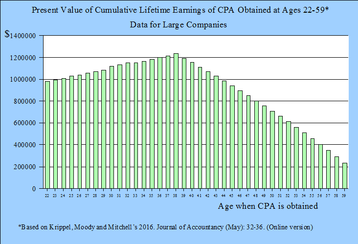
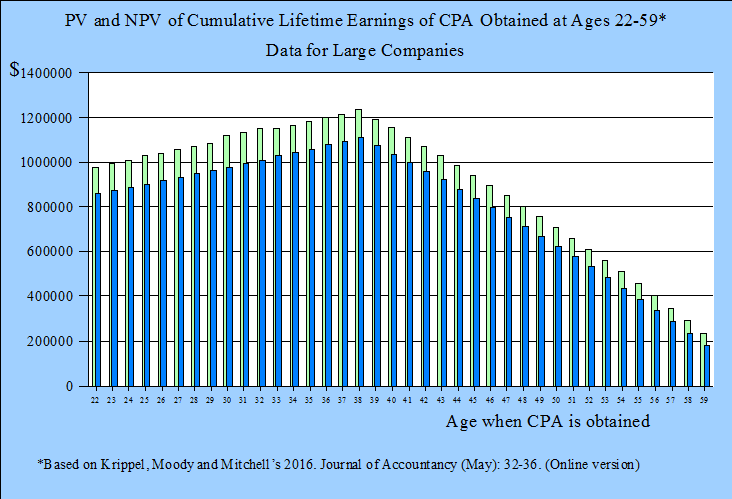
Bar Charts - A bar chart illustrates grouped data with rectangular bars where the lengths of the bars are proportional to the values that they represent. The two examples below are from Krippel, G. L., J. Moody and S. Mitchell. 2016. CPA credential delivers high value. Journal of Accountancy (May): 32-36. (Summary).
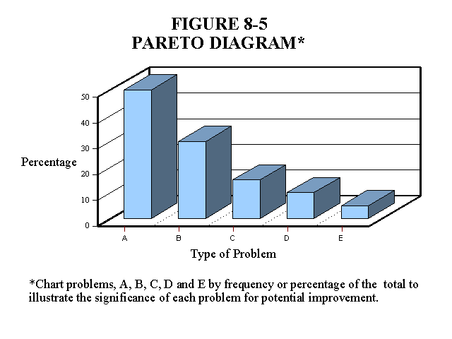
Pareto Diagrams - A Pareto diagram shows the causes of problems in bar chart format. The Pareto diagram in Figure 8-5 if from Martin, J. R. Not dated. Chapter 8: Just-In-Time, Theory of Constraints, and Activity Based Management Concepts and Techniques. Management Accounting: Concepts, Techniques & Controversial Issues. Management And Accounting Web. Chapter8
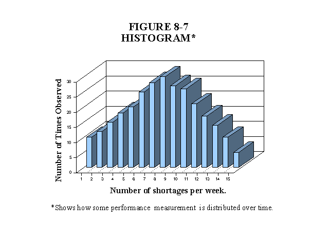
Histograms - A histogram is a bar chart that shows the distribution of a performance measurement such as the number of defects over a period of time. The histogram in figure 8-7 is from Martin, J. R. Not dated. Chapter 8: Just-In-Time, Theory of Constraints, and Activity Based Management Concepts and Techniques. Management Accounting: Concepts, Techniques & Controversial Issues. Management And Accounting Web. Chapter8
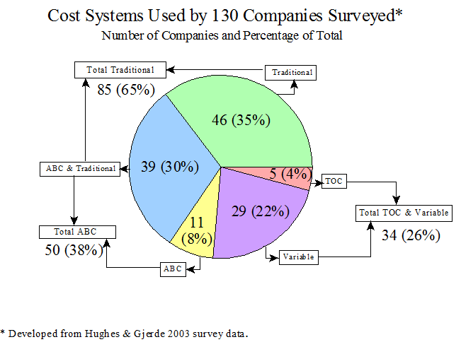
Pie charts - A pie chart illustrates the various parts of a problem, process or financial measurement in proportion to the whole. The pie chart below is from Hughes, S. B. and K. A. Paulson Gjerde. 2003. Do different cost systems make a difference? Management Accounting Quarterly (Fall): 22-30. (Summary).
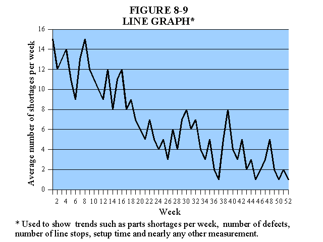
Line Charts - A line chart shows trends in a measurement such as parts shortages in a factory. The line graph below is also from Martin, J. R. Not dated. Chapter 8: Just-In-Time, Theory of Constraints, and Activity Based Management Concepts and Techniques. Management Accounting: Concepts, Techniques & Controversial Issues. Management And Accounting Web. Chapter8
Visual discovery: Data Driven and Exploratory
Visual discovery includes two categories as indicated in Berinato's typology graphic above, visual confirmation, and visual exploration. Visual confirmation involves answering questions such as, Is what we suspect actually true? or What are some different ways of presenting this idea? Visual exploration involves open-ended data where you don't know what you are looking for. For example, where a large amount of data in a spreadsheet doesn't reveal trends and relationships until it's plotted on a graph.
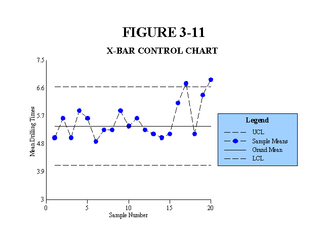
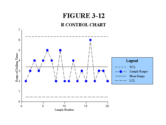
Control Charts - A control chart or Shewhart chart shows process measurements plotted on a graph to determine if the process or system is stable and predictable. Control charts include X-bar charts and R charts. The X-bar chart and R-chart below are from Martin, J. R. Not dated. Chapter 3: Cost Behavior Analysis & Statistical Process Control - Part II. Management Accounting: Concepts, Techniques & Controversial Issues. Management And Accounting Web. Chapter3PartII
Idea generation: Conceptual and Exploratory
Idea generation takes place in brainstorming and strategy sessions. Mind maps seem to fit into this category.
Mind Maps - A mind map is a type of diagram used to visually organize information showing relationships between pieces of the whole. Mind maps focus on a single idea or concept. Concept maps are different in that they connect multiple ideas or concepts as illustrated above.3 Mind maps are usually drawn by hand and are typically used for note taking during a lecture, or for idea generation. The illustration below is more formal, but could have resulted from drawings based on illustrations or discussions during a class lecture.
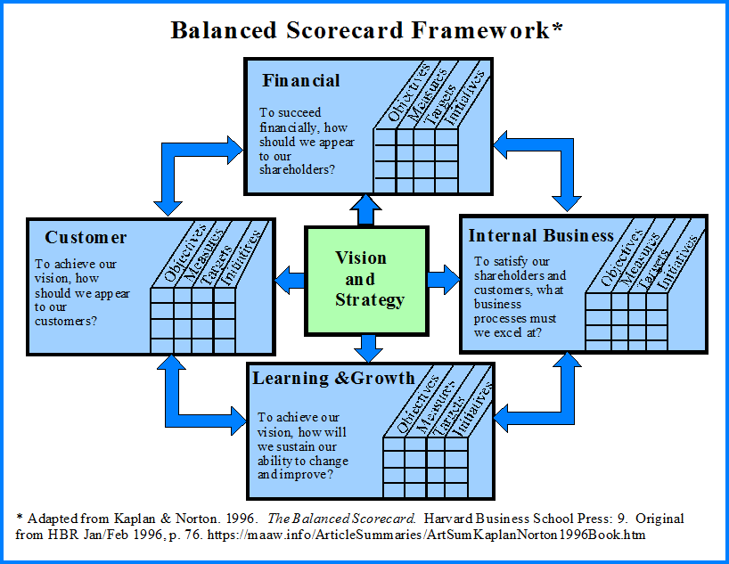
The main concept in the balanced scorecard framework is strategy. The following illustration shows the connections. See Kaplan, R. S. and D. P. Norton. 1996. The Balanced Scorecard: Translating Strategy into Action Boston: Harvard Business School Press. (Summary).
This summary includes samples from hundreds of graphic illustrations or visualizations on the MAAW web site. The best way to find illustrations related to a specific topic is to go to that topic's main page and look at the article and book summaries listed.
________________________________________
Footnotes:
1 For an index that includes a large number of different types of diagrams see org/wiki/Diagram
2 Berinato, S. 2016. Visualizations that really work. Harvard Business Review (June): 92-100. (Summary).
3 These definitions are similar to those used in Wikipedia. See org/wiki/Mind_map